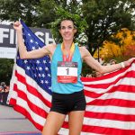
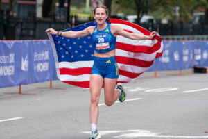
With the beginning of a new decade comes the chance for many brands, events, and companies to switch up their look, logo, and colors. At the Boston 10K for Women, we did all three. We sat down with runner, mother, and graphic designer Mariya Michniewicz of Conventures to learn about the new race brand and the inspiration behind it.
How would you describe the new colors?
I would describe them as a bright shade of Royal Blue paired with a powerful, feminine and vibrant coral, which we call Bold Coral. The colors were inspired by the race history and energy.
How about the new logo?
We wanted to keep the logo simple, but also highlighting the distance and the word Women. We think it’s pretty incredible that the race remains the second longest-running all-women’s sporting event in the world.

What are some of the new design elements? We see a lot of miniature arrows and plus signs throughout.
The new identity we created mixes blocks of colors with patterns made of circles, plus signs and arrows. The circle represents the individual runner and brings a sense of completeness. The plus sign represents inclusion and togetherness. The up and forward pointing arrow represents the aspiration to uplift and empower women through running. Yes, we obsess over small details.
You are a runner yourself. Have you done this race before?
I have not, but I’ve been at the Start and Finish lines for the past 12 years. Watching the sea of strong women taking on the streets of Boston is so inspiring. I hope I get to experience this day as a runner too. Running it with my daughter, when she is old enough, will be the cherry on top.